Using Interrupted Time Series to Evaluate a National Policy to Undo Race-Based Harm in Kidney Transplantation
Published
March 23, 2026
This note is a companion to the Quasi-Experimental Designs chapter of Global Health Research in Practice. It uses a recent study of kidney transplant policy to introduce interrupted time series analysis—one of the most widely used quasi-experimental designs for evaluating policies and programs when randomization is not possible.
In this episode of Research Notes, Eric talks with Dr. Rohan Khazanchi about his recent paper in JAMA Internal Medicine examining what happened when race was removed from equations used to estimate kidney function.
For more than two decades, the equations U.S. physicians used to estimate kidney function assigned higher values to Black patients. Not because of any measured physiological difference in an individual patient, but because of a race coefficient baked into the formula.1 These equations estimated glomerular filtration rate (eGFR)—the standard measure of how well your kidneys work—16% to 21% higher for patients classified as Black compared to all others with the same age, sex, and creatinine level.
Higher eGFR means healthier kidneys on paper. For Black patients with failing kidneys, this error meant delayed diagnosis of chronic kidney disease, delayed referral to a nephrologist, and critically, delayed placement on the transplant waiting list. Wait time on the list is a major factor in the Kidney Allocation System that determines who gets a deceased donor kidney. Every month of delayed listing is a month of lost priority.
The consequences were not abstract. End-stage kidney disease is nearly four times more prevalent among Black Americans than White Americans. CKD progresses faster. Yet Black patients were more likely to be waitlisted after starting dialysis, received transplants more slowly, and had lower overall transplant rates.2 An algorithm designed to improve clinical precision was instead encoding and amplifying a racial inequity at national scale.
In 2021, after years of advocacy and mounting evidence, the National Kidney Foundation and the American Society of Nephrology recommended shifting to a race-neutral eGFR equation. In July 2022, the Organ Procurement and Transplantation Network (OPTN) mandated that transplant centers stop using race-based equations to register candidates. But this forward-looking change did not address the years of wait time that Black candidates had lost.
So in January 2023, OPTN took a reparative step: it mandated retroactive wait time modifications for Black candidates whose listing had been delayed by the race-based formula.3 Transplant centers were required to identify eligible candidates, recalculate when they would have been listed under a race-neutral equation, and backdate their listing accordingly. More than 21,000 candidates received modifications, gaining a median of 1.7 additional years of wait time and a total of over 51,000 person-years.
Did it work? Did the policy actually increase transplant rates for Black candidates? And did it come at the expense of other groups—a zero-sum redistribution of a scarce resource? A study published in JAMA Internal Medicine by Khazanchi et al. (2026) used an interrupted time series design to find out. These are causal questions, and answering them requires more than comparing transplant rates before and after the policy. It requires a design that can separate the policy’s effect from everything else that was changing at the same time.
The Causal Inference Problem
The challenge is familiar: a policy was implemented nationally, at a single point in time, for a defined population. There is no randomization. There is no randomized control group. There is a comparison group (non-Black candidates whose wait times were not modified) but they were subject to the same system-wide changes, and the fixed organ supply means one group’s gain could be another’s loss. You cannot rewind and observe what would have happened without the policy.
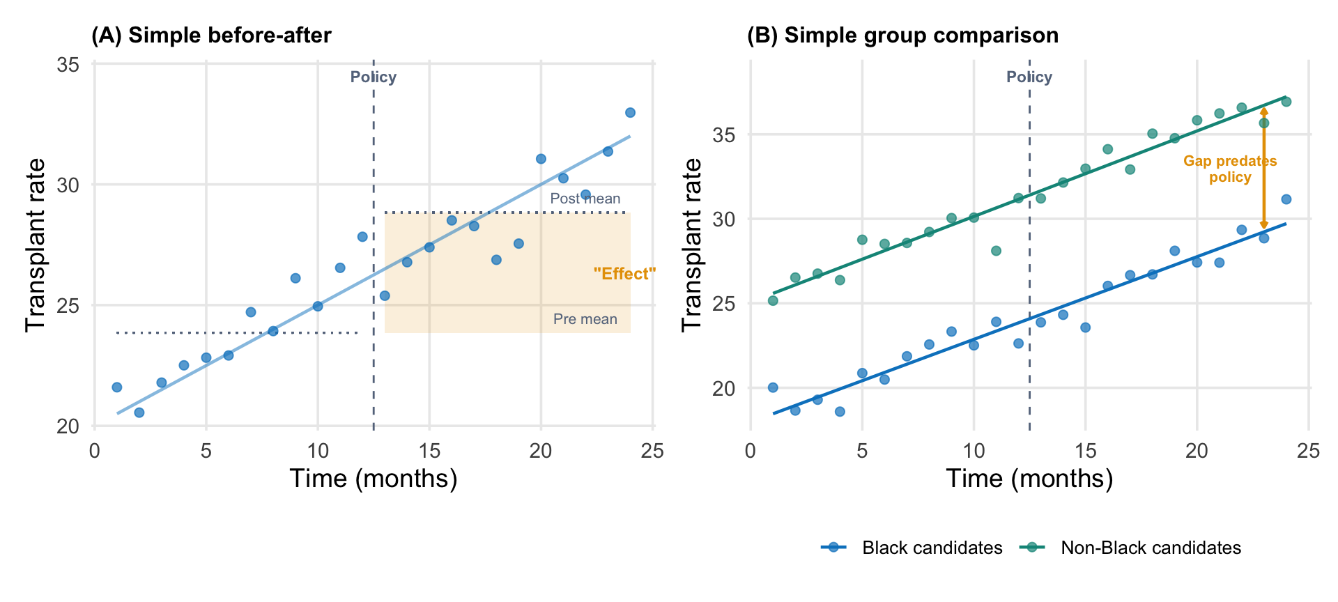
A simple before-after comparison—transplant rates were X before January 2023 and Y after—would be misleading. Transplant rates were already trending upward before the policy, driven by increases in organ supply, changes in allocation rules, and other system-level factors. If you naively compared the pre and post periods, you would attribute the continuation of that trend to the policy.
You also cannot simply compare Black candidates (who were eligible for modifications) to non-Black candidates (who were not) without accounting for the fact that these groups had different baseline rates and potentially different trajectories. And because kidney transplantation draws from a fixed organ supply, giving priority to one group could, in principle, reduce transplant rates for others, creating a spillover that would contaminate any simple comparison.
Why naive approaches mislead (illustrative data). (A) A simple before-after comparison attributes the pre-existing upward trend to the policy. The shaded region shows the apparent effect, but most of it is just the trend continuing. (B) A simple group comparison shows a gap between Black and non-Black candidates, but that gap existed before the policy. Without modeling trends, you cannot tell whether the policy changed anything.
What you need is a design that can model the pre-existing trend, identify a discrete shift at the point of implementation, and distinguish the policy’s effect from secular changes that would have occurred anyway. This is what interrupted time series analysis does.
Interrupted Time Series Design
An interrupted time series (ITS) is a quasi-experimental design for evaluating interventions that are implemented at a known point in time, when repeated measurements of the outcome are available before and after.4 It is one of the strongest designs available when randomization is not feasible, which is often the case for national policy changes.
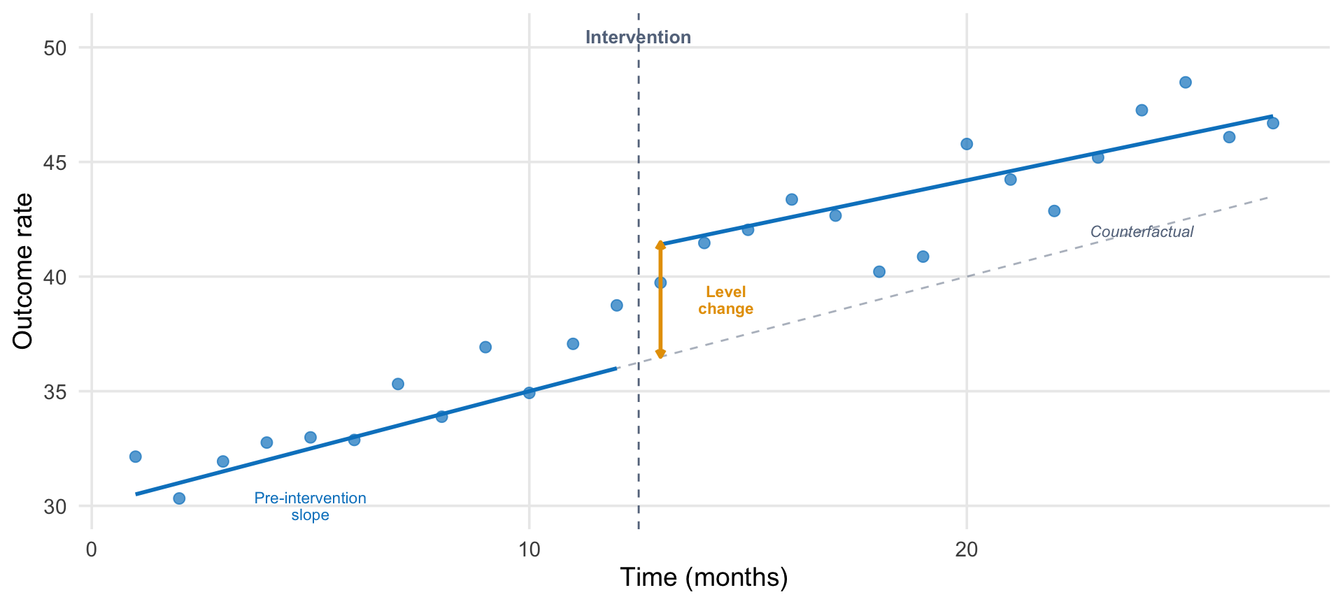
The logic is straightforward. With enough pre-intervention observations, you can estimate the underlying trend in the outcome (the trajectory it was on before anything changed). The intervention creates an “interruption.” If the outcome deviates from the projected trend after the intervention, that deviation is attributed to the policy.
An ITS model typically estimates three things:
Pre-intervention slope: the trend in the outcome before the intervention.
Level change: the immediate shift at the point of intervention.
Post-intervention slope change: whether the trend changed after the intervention.
Show code
# Create a clean pedagogical ITS diagramn_pre <-12n_post <-15intervention <- n_pre +1time <-1:(n_pre + n_post)pre <- time <= n_prepost <- time > n_pre# Parameters (simplified for pedagogy)intercept <-30pre_slope <-0.5level_change <-5post_slope_change <--0.1# True trendy_trend <-ifelse(pre, intercept + pre_slope * time, intercept + pre_slope * time + level_change + post_slope_change * (time - n_pre))# Counterfactualy_counterfactual <- intercept + pre_slope * time# Add noiseset.seed(42)y_obs <- y_trend +rnorm(length(time), 0, 1.2)df_its <-tibble(time = time,observed = y_obs,trend = y_trend,counterfactual = y_counterfactual,period =ifelse(pre, "Pre", "Post"))ggplot(df_its) +# Intervention linegeom_vline(xintercept = n_pre +0.5, linetype ="dashed",color = ghr_slate, linewidth =0.5) +# Counterfactualgeom_line(aes(x = time, y = counterfactual),linetype ="dashed", color = ghr_slate, alpha =0.5) +# Observed pointsgeom_point(aes(x = time, y = observed, color = period), size =2.5, alpha =0.7) +# Trend lines (pre and post separately)geom_line(data =filter(df_its, period =="Pre"),aes(x = time, y = trend), color = ghr_blue, linewidth =1) +geom_line(data =filter(df_its, period =="Post"),aes(x = time, y = trend), color = ghr_blue, linewidth =1) +# Annotationsannotate("text", x = n_pre +0.5, y =max(y_obs) +2,label ="Intervention", size =3.5, color = ghr_slate, fontface ="bold") +annotate("segment",x = n_pre +1, xend = n_pre +1,y = intercept + pre_slope * (n_pre +1),yend = intercept + pre_slope * (n_pre +1) + level_change,color = ghr_orange, linewidth =1,arrow =arrow(length =unit(0.15, "cm"), ends ="both")) +annotate("text", x = n_pre +2.5,y = intercept + pre_slope * (n_pre +1) + level_change /2,label ="Level\nchange", size =3, color = ghr_orange,lineheight =0.9, fontface ="bold") +annotate("text", x =5, y = intercept + pre_slope *5-2.5,label ="Pre-intervention\nslope", size =3, color = ghr_blue,lineheight =0.9) +annotate("text", x = n_pre + n_post -3,y = y_counterfactual[length(y_counterfactual)] -1.5,label ="Counterfactual", size =3, color = ghr_slate,fontface ="italic") +scale_color_manual(values =c("Pre"= ghr_blue, "Post"= ghr_blue),guide ="none") +labs(x ="Time (months)", y ="Outcome rate") +theme(panel.grid.minor =element_blank())
Anatomy of an interrupted time series. The intervention occurs at a known point in time. The ITS model estimates the pre-intervention trend, the immediate level change, and any change in the post-intervention trend. The counterfactual (dashed gray line) extends the pre-intervention trend to show what would have been expected without the intervention.
The key insight is the counterfactual: the dashed line extending the pre-intervention trend into the post period. This is what we would expect to observe if the intervention had not occurred. The treatment effect at any post-intervention time point is the difference between the observed outcome and this counterfactual projection.
Why does this work from a causal inference perspective? The core problem is that time is a backdoor between the intervention and the outcome. It drives both when treatment turns on and secular changes in the outcome. ITS closes that backdoor by modeling the time-outcome relationship from pre-intervention data and projecting it forward. The counterfactual is an explicit prediction of what time alone would have produced. For a deeper treatment of this logic, see Nick Huntington-Klein’s chapter on event studies and interrupted time series in The Effect.
What Can Go Wrong
ITS designs rest on several assumptions:
Stable pre-intervention trend. The model needs enough pre-intervention data points to estimate a reliable trend. If the pre-intervention period is too short, noisy, or itself contains shocks, the projected counterfactual will be wrong.
No co-occurring events. If something else changed at the same time as the intervention—a new drug became available, another policy was implemented, a pandemic wave hit—the ITS cannot separate the effects. This is perhaps the most serious threat.
No anticipation. The outcome should not start changing before the intervention is implemented. If clinicians or patients alter behavior in anticipation of a policy, the pre-intervention trend will be contaminated.
Consistent measurement. If how the outcome is measured or recorded changes at the time of the intervention, apparent effects may be artifacts of measurement change rather than real shifts.
Two strategies can strengthen an ITS design considerably. First, a comparison group: a population not affected by the intervention but subject to the same secular trends. If the comparison group shows no change at the intervention point while the treated group does, the case for a causal effect is much stronger. Second, a non-equivalent dependent variable: an outcome that should be subject to the same secular trends but should not respond to the intervention. If liver transplant rates (for example) showed the same jump at the same time as kidney transplant rates, you would suspect a system-wide change rather than a kidney-specific policy effect. If they did not jump, you have another piece of evidence that the shift was caused by the intervention.
What Khazanchi et al. Did
Khazanchi et al. (2026) applied an ITS design to evaluate the OPTN wait time modification policy, using national data from the OPTN on all 181,314 adult kidney transplant candidates actively waitlisted between January 2022 and June 2025.5
Their design had several features worth examining:
The Outcome
The outcome was the monthly kidney transplant rate per 1,000 waitlisted candidates, stratified by race (Black vs. non-Black and/or Hispanic). Each observation in the dataset was a candidate-listing-month: a record of whether a given candidate on the waitlist in a given month received a transplant.
The Model
They used GEE with a logit link to estimate the standard ITS parameters (pre-implementation slope, level change, and post-implementation slope change) separately for Black and non-Black candidates. The model adjusted for both time-invariant factors (age, sex, insurance, blood type, diagnosis, OPTN region, prior transplant) and time-varying factors (dialysis status, cPRA score, number of active listing centers).
The Washout Period
The study excluded a three-month washout period from January through March 2023. This decision was based on the observation that very few wait time modifications were processed during those months (Figure 1 in the paper shows the sharp ramp-up beginning in April 2023). Including the washout months would contaminate the post-intervention estimate with a period when the policy was technically in effect but not yet operationally implemented.
This is a common and important design choice in ITS. Policies rarely switch on instantaneously. Excluding the rollout period prevents the gradual implementation from biasing the level change estimate toward zero. Khazanchi et al. tested alternative washout periods (0, 6, 9, and 12 months) and found that the level change estimate grew with longer washouts—from 2.8 transplants per 1,000 listings (no washout) to 11.9 (12-month washout)—suggesting that the 3-month specification was conservative.
The Comparison Group
Non-Black candidates served as a natural comparison group. They were subject to the same secular trends in organ supply, allocation rules, and transplant center behavior, but were not eligible for wait time modifications. If the policy effect were driven by a system-wide change rather than the race-specific intervention, it should appear in both groups.
Why not difference-in-differences? Readers might wonder why the authors did not formally combine the two groups in a comparative ITS or difference-in-differences framework. Turns out they did! In the podcast, Dr. Khazanchi said they wrote up a Diff-in-Diff analysis, and reviewers helped them to see why it was the wrong approach. As they explain in the ITS paper: kidney transplantation draws from a fixed organ supply. Increasing transplant rates for one group could, in principle, decrease rates for another. This violates the stable unit treatment value assumption (SUTVA): the assumption that one group’s treatment does not affect the other group’s outcome. Because of this potential spillover, Khazanchi et al. present the two groups’ ITS results side by side rather than formally differencing them. As it turned out, non-Black transplant rates were not significantly affected, suggesting the policy was not zero-sum in practice. But the decision not to assume this in the design is methodologically careful.
The Results
Show code
results <-tibble(Group =c("Black candidates", "Non-Black and/or Hispanic candidates"),`Pre-implementation slope`=c("0.58 (0.37, 0.79)", "0.62 (0.47, 0.77)"),`Level change`=c("5.3 (3.5, 7.0)", "−0.6 (−1.8, 0.7)"),`Post-implementation slope`=c("−0.10 (−0.17, −0.03)", "−0.10 (−0.15, −0.05)"))kable(results,caption ="ITS estimates from Khazanchi et al. (2026). Values are transplants per 1,000 listings (level change) or transplants per 1,000 listings per month (slopes). 95% CIs in parentheses.") |>kable_styling(full_width =TRUE, font_size =13,bootstrap_options =c("condensed")) |>column_spec(1, bold =TRUE, width ="25%")
ITS estimates from Khazanchi et al. (2026). Values are transplants per 1,000 listings (level change) or transplants per 1,000 listings per month (slopes). 95% CIs in parentheses.
Group
Pre-implementation slope
Level change
Post-implementation slope
Black candidates
0.58 (0.37, 0.79)
5.3 (3.5, 7.0)
−0.10 (−0.17, −0.03)
Non-Black and/or Hispanic candidates
0.62 (0.47, 0.77)
−0.6 (−1.8, 0.7)
−0.10 (−0.15, −0.05)
The key findings:
Both groups had similar pre-implementation trends (approximately 0.6 transplants per 1,000 listings per month), confirming that the groups were on parallel trajectories before the policy.
At implementation, Black candidates experienced a level increase of 5.3 transplants per 1,000 listings. Non-Black candidates showed no significant change (−0.6, with a confidence interval spanning zero).
Post-implementation, both groups showed similar slight declines in trend (−0.10 per month), suggesting a mild secular deceleration affecting the entire system.
The effect was driven almost entirely by deceased donor kidney transplants (DDKT), which is mechanistically what you would expect: wait time determines priority for deceased donor allocation. Living donor transplants (LDKT), which are arranged independently of the waitlist, showed no significant change.
Replicating the Analysis
The analysis below uses data from the Organ Procurement and Transplantation Network (OPTN). I aggregated patient-level records into monthly transplant rates by race group—no individual-level data is shown or distributed.6
The Data
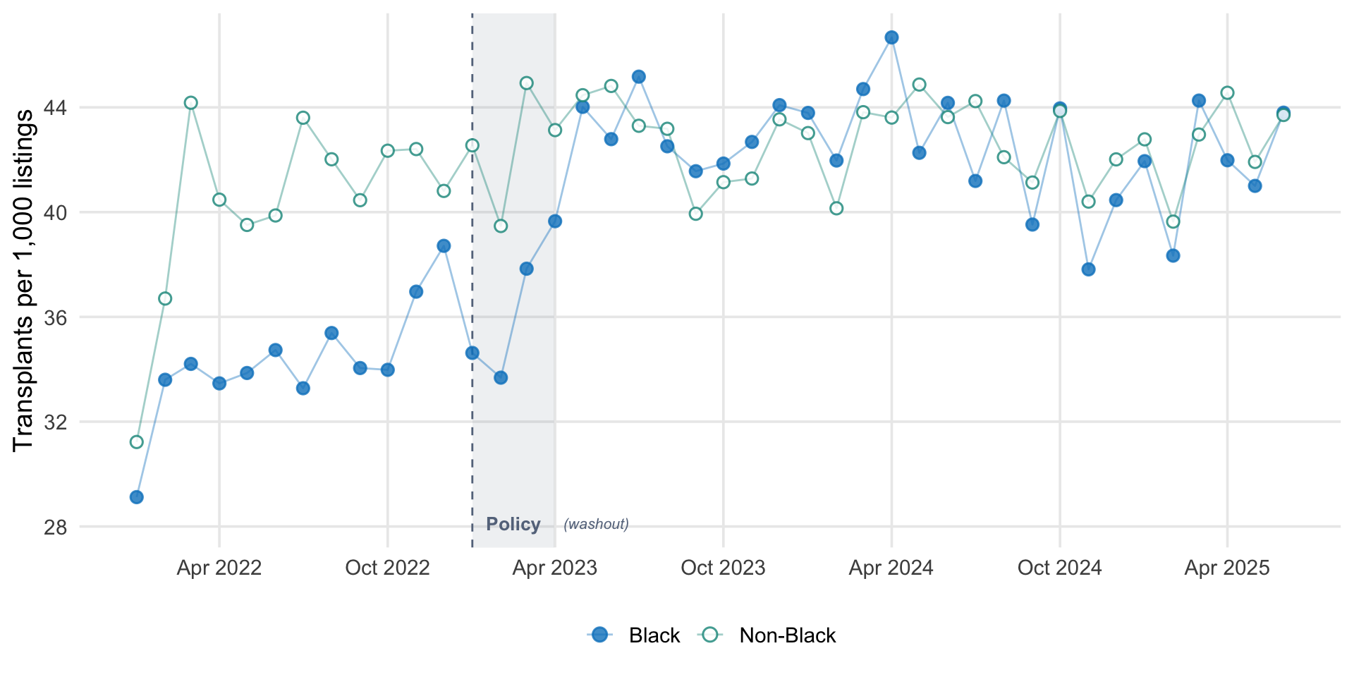
For each month from January 2022 through June 2025, I computed the number of kidney transplants and the number of actively waitlisted candidates, separately for Black and non-Black candidates. The transplant rate is expressed as transplants per 1,000 active listings per month.
Monthly kidney transplant rates per 1,000 active waitlist listings, by race group. The vertical dashed line marks the OPTN wait time modification policy (January 2023). The shaded gray region is the three-month washout period excluded from the primary analysis.
Fitting the ITS Model
The standard ITS model requires three time variables:
time: a counter for each month (1, 2, 3, …)
post: an indicator for the post-intervention period (0 before, 1 after the washout)
time_after: months elapsed since the intervention (0 before, 1, 2, 3… after)
Show code
tibble(`month`=c("Jan 2022", "Feb 2022", "...", "Dec 2022","Jan–Mar 2023", "Apr 2023", "May 2023", "..."),`rate`=c("29.1", "33.6", "...", "34.5","", "38.2", "40.1", "..."),`time`=c(1, 2, "...", 12, "(excluded)", 13, 14, "..."),`post`=c(0, 0, "...", 0, "(excluded)", 1, 1, "..."),`time_after`=c(0, 0, "...", 0, "(excluded)", 1, 2, "...")) |>kable(caption ="How the ITS dataset is structured (shown for Black candidates). Each row is a group-month. The outcome (**rate**) is transplants per 1,000 active listings. The three time variables encode the ITS structure: **time** counts months continuously (skipping the washout), **post** switches on after the washout, and **time_after** counts months since the intervention.",align =c("l", "r", "c", "c", "c")) |>kable_styling(full_width =FALSE, font_size =13,bootstrap_options =c("condensed")) |>row_spec(5, italic =TRUE, color = ghr_slate)
How the ITS dataset is structured (shown for Black candidates). Each row is a group-month. The outcome (**rate**) is transplants per 1,000 active listings. The three time variables encode the ITS structure: **time** counts months continuously (skipping the washout), **post** switches on after the washout, and **time_after** counts months since the intervention.
month
rate
time
post
time_after
Jan 2022
29.1
1
0
0
Feb 2022
33.6
2
0
0
...
...
...
...
...
Dec 2022
34.5
12
0
0
Jan–Mar 2023
(excluded)
(excluded)
(excluded)
Apr 2023
38.2
13
1
1
May 2023
40.1
14
1
2
...
...
...
...
...
The model is then: \(\text{rate} = \beta_0 + \beta_1 \cdot \text{time} + \beta_2 \cdot \text{post} + \beta_3 \cdot \text{time\_after}\), where \(\beta_1\) captures the pre-intervention trend, \(\beta_2\) the level change, and \(\beta_3\) the change in slope after the intervention.
I fit a simple OLS segmented regression separately for each group. This is a simplified version of the GEE model Khazanchi et al. used. It captures the same three ITS parameters (pre-slope, level change, post-slope change) but does not account for the binary outcome, repeated measures, or covariates.
Show code
fit_black <-lm(rate ~ time + post + time_after,data =filter(its_data, race_group =="Black"))fit_nonblack <-lm(rate ~ time + post + time_after,data =filter(its_data, race_group =="Non-Black"))
Show code
extract_its <-function(fit, group_name) { coefs <-summary(fit)$coefficientstibble(Group = group_name,`Pre-implementation slope`=sprintf("%.2f (%.2f, %.2f)", coefs["time", 1], coefs["time", 1] -1.96* coefs["time", 2], coefs["time", 1] +1.96* coefs["time", 2]),`Level change`=sprintf("%.2f (%.2f, %.2f)", coefs["post", 1], coefs["post", 1] -1.96* coefs["post", 2], coefs["post", 1] +1.96* coefs["post", 2]),`Post-implementation slope change`=sprintf("%.2f (%.2f, %.2f)", coefs["time_after", 1], coefs["time_after", 1] -1.96* coefs["time_after", 2], coefs["time_after", 1] +1.96* coefs["time_after", 2]) )}its_results <-bind_rows(extract_its(fit_black, "Black candidates"),extract_its(fit_nonblack, "Non-Black candidates"))kable(its_results,caption ="Simplified ITS estimates from OPTN data. Values are transplants per 1,000 listings (level change) or per month (slopes). 95% CIs in parentheses. These estimates use OLS without covariates or GEE clustering, so they will differ from the published results.") |>kable_styling(full_width =TRUE, font_size =13,bootstrap_options =c("condensed")) |>column_spec(1, bold =TRUE, width ="20%")
Simplified ITS estimates from OPTN data. Values are transplants per 1,000 listings (level change) or per month (slopes). 95% CIs in parentheses. These estimates use OLS without covariates or GEE clustering, so they will differ from the published results.
Group
Pre-implementation slope
Level change
Post-implementation slope change
Black candidates
0.49 (0.17, 0.81)
6.29 (3.72, 8.85)
-0.55 (-0.88, -0.21)
Non-Black candidates
0.54 (0.20, 0.89)
-0.26 (-3.01, 2.50)
-0.56 (-0.92, -0.21)
Visualizing the ITS Fit
Show code
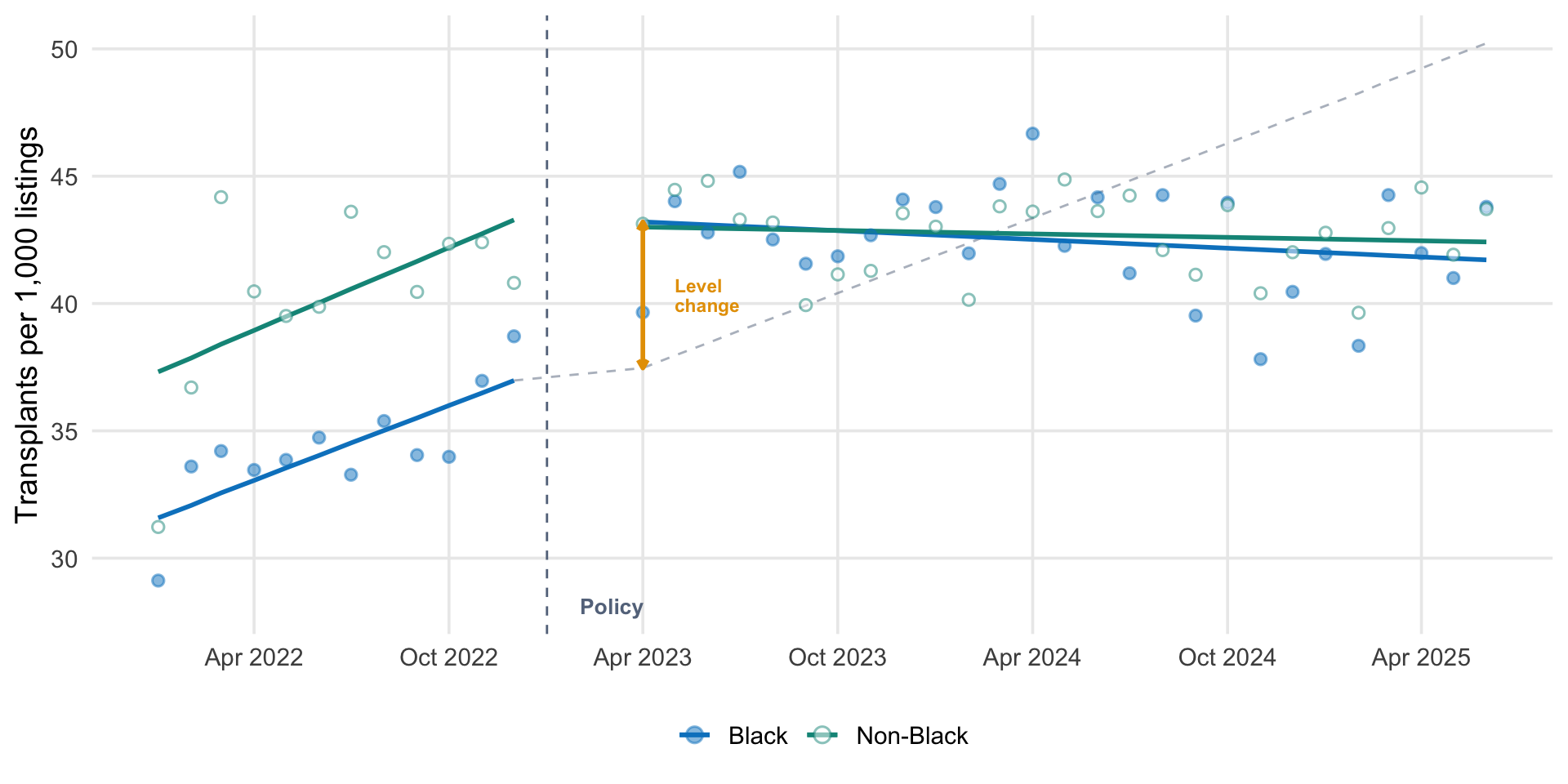
# Generate predictionsits_data <- its_data |>mutate(fitted =if_else( race_group =="Black",predict(fit_black, newdata =pick(everything())),predict(fit_nonblack, newdata =pick(everything())) ) )# Counterfactual: extend pre-intervention trend into post period# Create a separate data frame that spans from last pre month through all post monthsblack_pre_last <- its_data |>filter(race_group =="Black", post ==0) |>slice_max(time)black_post <- its_data |>filter(race_group =="Black", post ==1)# Build counterfactual line from last pre-intervention month through endcf_times <-c(black_pre_last$time, black_post$time)cf_months <-c(black_pre_last$month, black_post$month)cf_values <-coef(fit_black)["(Intercept)"] +coef(fit_black)["time"] * cf_timescf_line <-tibble(month = cf_months, counterfactual = cf_values)# Also compute counterfactual at all time points for the level change annotationits_data <- its_data |>mutate(counterfactual =if_else( race_group =="Black",coef(fit_black)["(Intercept)"] +coef(fit_black)["time"] * time,NA_real_ ) )# Compute level change for annotationblack_post_start <- black_post |>slice_min(month)black_cf_at_post <-coef(fit_black)["(Intercept)"] +coef(fit_black)["time"] * black_post_start$timeblack_fitted_at_post <-predict(fit_black, newdata = black_post_start)effect_y_top <- black_fitted_at_posteffect_y_bot <- black_cf_at_posteffect_x <- black_post_start$monthggplot(its_data, aes(x = month, color = race_group, fill = race_group)) +# Counterfactual for Black: from last pre-intervention month through postgeom_line(data = cf_line, aes(x = month, y = counterfactual),linetype ="dashed", color = ghr_slate, alpha =0.5,inherit.aes =FALSE) +# Fitted lines (pre and post separately)geom_line(data =filter(its_data, post ==0),aes(y = fitted), linewidth =1) +geom_line(data =filter(its_data, post ==1),aes(y = fitted), linewidth =1) +# Observed datageom_point(aes(y = rate), size =2, alpha =0.5, shape =21, stroke =0.8) +# Policy linegeom_vline(xintercept =as.Date("2023-01-01"), linetype ="dashed",color = ghr_slate, linewidth =0.5) +# Level change annotationannotate("segment",x = effect_x, xend = effect_x,y = effect_y_bot, yend = effect_y_top,color = ghr_orange, linewidth =1,arrow =arrow(length =unit(0.15, "cm"), ends ="both")) +annotate("text", x = effect_x +30,y = (effect_y_bot + effect_y_top) /2,label ="Level\nchange", size =3, color = ghr_orange,fontface ="bold", lineheight =0.9, hjust =0) +annotate("text", x =as.Date("2023-02-01"),y =min(its_data$rate) -1,label ="Policy", size =3.5, color = ghr_slate,fontface ="bold", hjust =0) +scale_color_manual(values =c("Black"= ghr_blue,"Non-Black"= ghr_teal),guide =guide_legend(override.aes =list(shape =21, size =3,fill =c(ghr_blue, "white")))) +scale_fill_manual(values =c("Black"= ghr_blue,"Non-Black"="white"), guide ="none") +scale_x_date(date_breaks ="6 months", date_labels ="%b %Y") +labs(x =NULL, y ="Transplants per 1,000 listings",color =NULL) +theme(legend.position ="bottom",panel.grid.minor =element_blank())
Interrupted time series fit to OPTN data. Solid lines show the fitted pre- and post-intervention trends for each group. The dashed gray line extends the pre-intervention trend into the post period (the counterfactual). The gap between the counterfactual and the fitted post-intervention line at the intervention point is the estimated level change.
The pattern is consistent with Khazanchi et al.’s findings: a visible level shift for Black candidates at the intervention point, with no corresponding shift for the non-Black comparison group. The pre-intervention trends are similar across groups, and both show comparable post-intervention slope changes.
The estimates from this simplified model will differ from the published results because Khazanchi et al. used GEE with a logit link on the binary transplant outcome at the candidate-month level, adjusting for a rich set of covariates. The simplified model here fits rates directly with OLS, without adjustment. The direction and pattern of effects, however, should be broadly consistent, and this is the pedagogical point. The ITS design identifies the policy effect through the structure of the time series, not through covariate adjustment alone.
Reading the Counterfactual
One pattern worth noting: the counterfactual line (the projection of the pre-intervention trend) eventually converges with the post-intervention fitted line for Black candidates. This is visible in both my figure and in Figure 3 of the paper. Does this mean the policy effect disappeared?
Not exactly. The pre-intervention trend for Black candidates was positive. Transplant rates were rising at roughly 0.5 per 1,000 listings per month. The policy created a large, immediate level jump. But the post-intervention slope for both groups decelerated slightly (both showed slope changes of about −0.10 per month), likely reflecting system-wide factors like organ supply growth plateauing. Meanwhile, the counterfactual keeps climbing at the steeper pre-intervention rate.
This convergence makes sense for this particular policy. The wait time modifications were a one-time reparative correction, not an ongoing structural change. The policy moved roughly 21,000 candidates up in priority. As those candidates received transplants or left the waitlist, the boost was gradually absorbed. The level change captures the immediate policy effect. The converging counterfactual reflects the fact that a one-time stock adjustment works through a flow system. Its marginal benefit at any given month diminishes over time, even as the cumulative benefit (additional transplants that would not have otherwise occurred) persists.
It Worked, But…
The policy worked. Transplant rates for Black candidates increased, driven by deceased donor kidneys, without reducing rates for other groups. But the policy may have disproportionately helped patients who were already in the system: those with regular access to care, consistent lab values, and active waitlist registrations. Khazanchi told STAT News’s Anil Oza:
I think there’s more thinking to be done about what inequities we have addressed with this policy, and what inequities might be actually getting a little bit worse with a policy of this nature that inherently prioritizes people who had consistent access to care or had lab values in the last couple of years leading up to their transplant wait listing, versus those patients who just get really sick really fast and might have a different story that leads to their transplant wait listing.
Less than a third of Black candidates received wait time modifications during the study period. Among those who did, modification recipients differed from nonrecipients in age, cPRA score, insurance, diagnosis, OPTN region, and dialysis status, suggesting that structural barriers to healthcare access shaped who could benefit from a policy designed to address structural harm.
This is a pattern familiar in global health: interventions that operate through existing systems tend to reach those who are already connected to those systems. A policy that backdates wait time for candidates already on the list cannot help someone who was never referred to a nephrologist in the first place.
Take-Home Messages
ITS is a powerful design for evaluating policies implemented at a known point in time. It models pre-existing trends and identifies deviations at the intervention point, providing stronger evidence than simple before-after comparisons.
A comparison group dramatically strengthens ITS. If a group not affected by the policy shows no change, co-occurring events are less likely to explain the observed effect. Khazanchi et al. used non-Black candidates as this comparison, showing stable trends while Black candidates’ rates increased.
Design choices matter. The washout period, the choice of comparison group, the handling of time-varying confounders, and the decision not to formally difference the groups (because of SUTVA concerns) each reflects a substantive judgment about the data-generating process. ITS results are only as credible as these choices.
The OPTN wait time modification policy increased deceased donor kidney transplant rates for Black candidates by approximately 5.3 transplants per 1,000 listings, without significantly reducing rates for other groups. This is evidence that reparative policies, interventions designed to undo specific and documented harms, can work.
Fixing the algorithm does not fix the pipeline. The policy reached candidates already on the waitlist. The deeper inequities—in CKD screening, nephrology referral, predialysis care, and transplant center access—remain. Undoing algorithmic harm is a start.
Footnotes
The 1999 Modification of Diet in Renal Disease (MDRD) and 2009 CKD Epidemiology Collaborative (CKD-EPI) equations.↩︎
These disparities have been extensively documented. See Ku et al. (2022), Purnell et al. (2018), and the National Academies of Sciences, Engineering, and Medicine (2022) report on the kidney transplant allocation system.↩︎
The policy, OPTN Policy 3.7.D: Waiting Time Modifications for Kidney Candidates Affected by Race-Inclusive eGFR Calculations, was enacted on January 5, 2023. Eligibility required a measured or estimated GFR of 20 mL/min/1.73 m² or lower using the race-neutral 2021 CKD-EPI equation, with prior documentation of a race-based eGFR value above that threshold.↩︎
For comprehensive introductions to ITS methods, see Bernal, Cummins, and Gasparrini (2017), “Interrupted time series regression for the evaluation of public health interventions: a tutorial,” and Wagner et al. (2002), “Segmented regression analysis of interrupted time series studies in medication use research.”↩︎
Khazanchi R, Fleishman A, Eneanya ND, et al. Wait time modifications for Black transplant candidates affected by race-based kidney function estimation. JAMA Intern Med. Published online March 9, 2026. doi:10.1001/jamainternmed.2026.0001↩︎
The data reported here have been supplied by the United Network for Organ Sharing as the contractor for the Organ Procurement and Transplantation Network. The interpretation and reporting of these data are the responsibility of the author(s) and in no way should be seen as an official policy of or interpretation by the OPTN or the U.S. Government. Based on OPTN data as of December 2025. Researchers can request OPTN data at optn.transplant.hrsa.gov/data/request-data.↩︎