Chapter 6 · Video 2
Imagine a world where the treatment does nothing
Print layout
Slide 1


Imagine a world where the treatment does nothing
Slide 2
Step 1
Specify two precise statistical hypotheses
H0, the null: there is no difference in average depression severity between the groups
H1, the alternative: the average difference between the groups is not zero
Two-tailed, so it does not specify which arm is superior
Slide 3
The null is where statistical inference happens
H1 is the hypothesis we talk about and write about
H0 is the one we test, and decide to reject or fail to reject
The Frequentist does not directly prove the alternative
Slide 4
Step 2
Imagine a world in which the null is true
Frequentists subscribe to the long run view of probability
That requires a collective: a group of events used to calculate a probability
Your study is just one event
Slide 5
You do not have to run your study 10,000 times
You can do it with your imagination and the magic of statistics
Picture running the study again and again, where the truth is always that the intervention does not work
The aim is to establish what type of data we're likely to find if the null hypothesis is true
Slide 6
A hypothetical population of 6,705 eligible patients
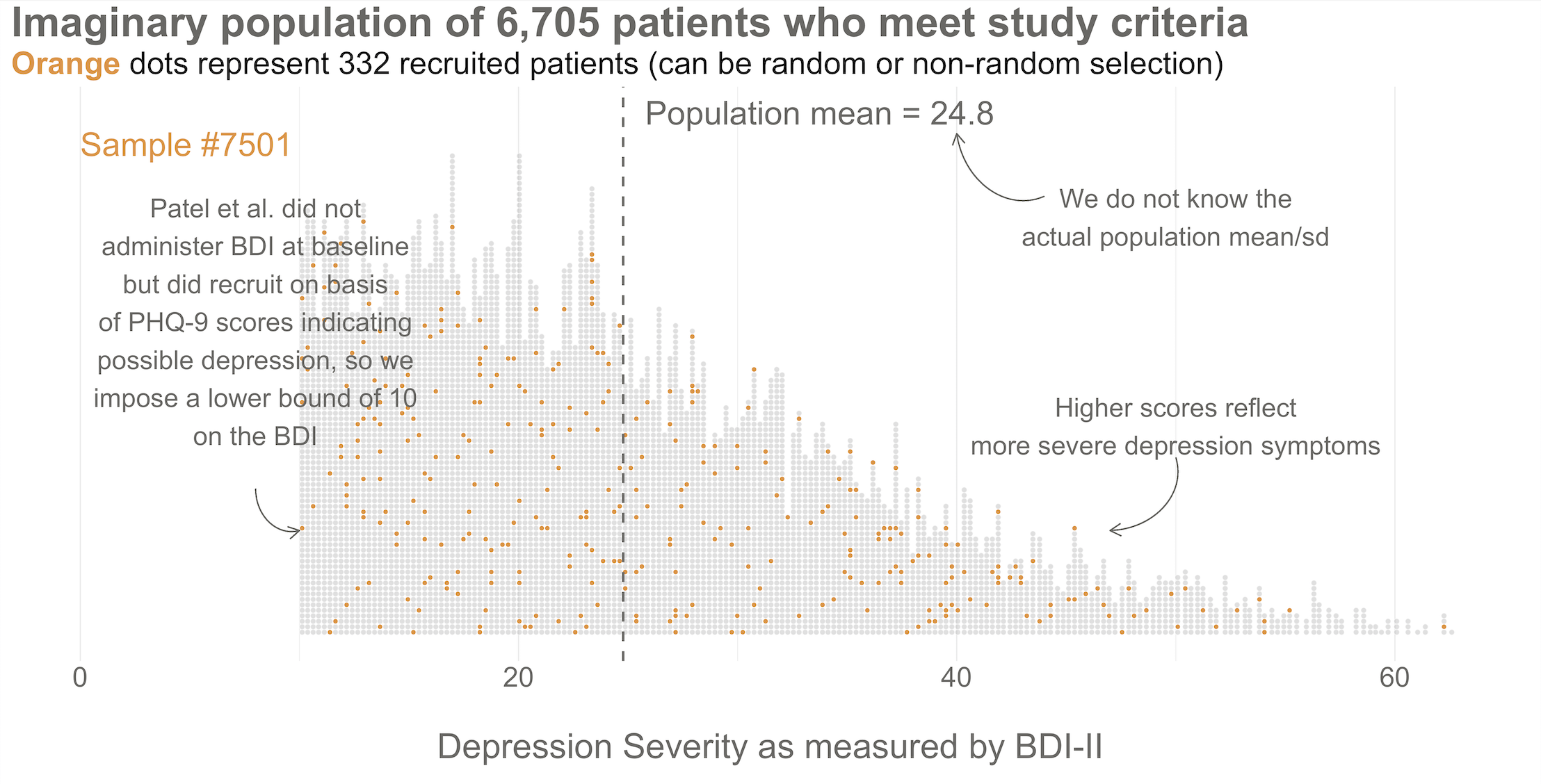
Hypothetical population of depressed patients. Center and spread come from the authors' protocol: a prior study reported a control BDI-II mean of 24.5, SD 10.7. Reproduced from Chapter 6.
Slide 7
One sample of 332 patients, drawn from that population
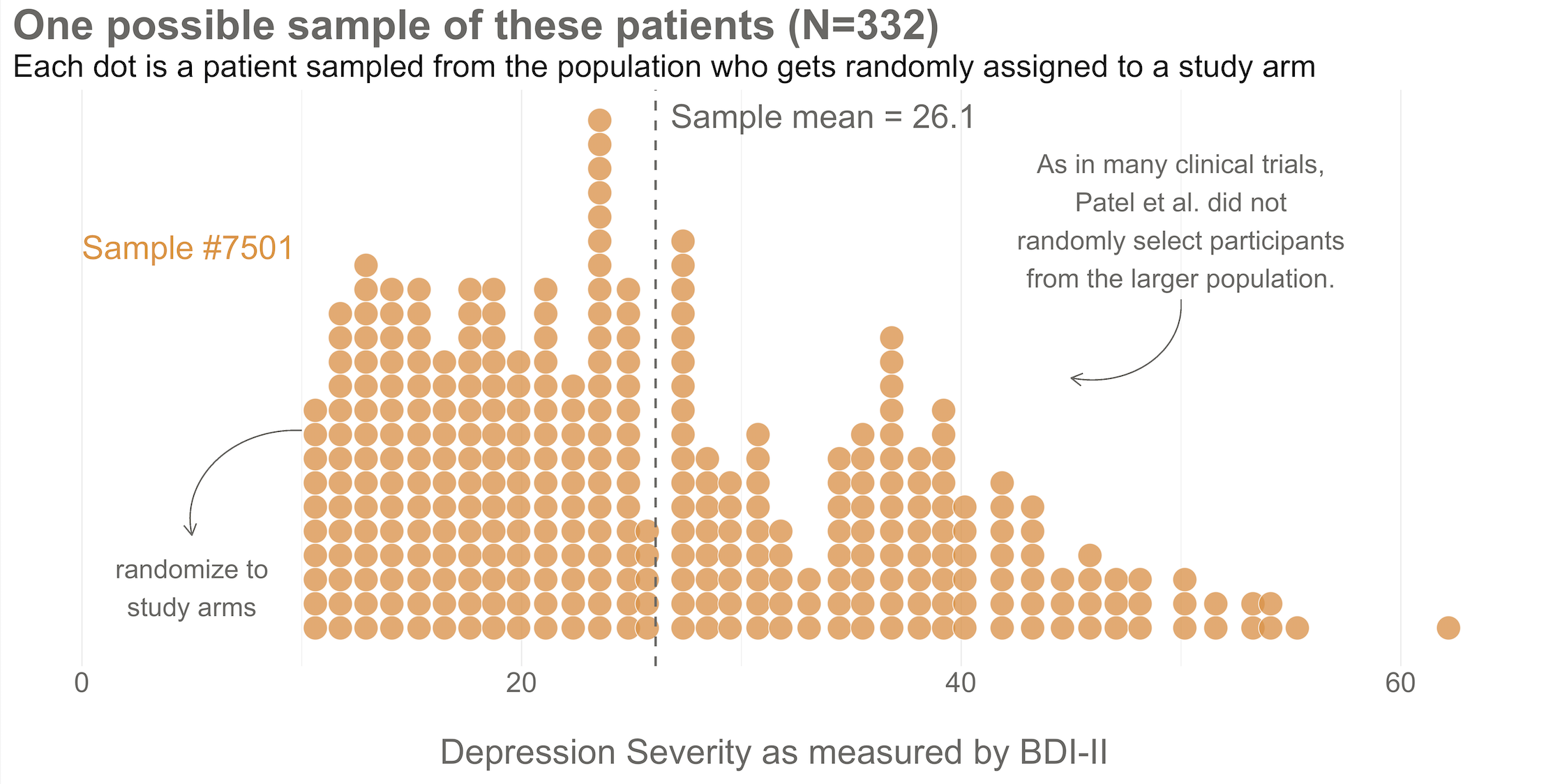
Here's the sample of 332 patients you recruit into your study. The trial planned to recruit 500 and expected to lose track of 15%, giving a planned effective sample of 332. Reproduced from Chapter 6.
Slide 8
Randomize 1:1 — 166 to treatment, 166 to control
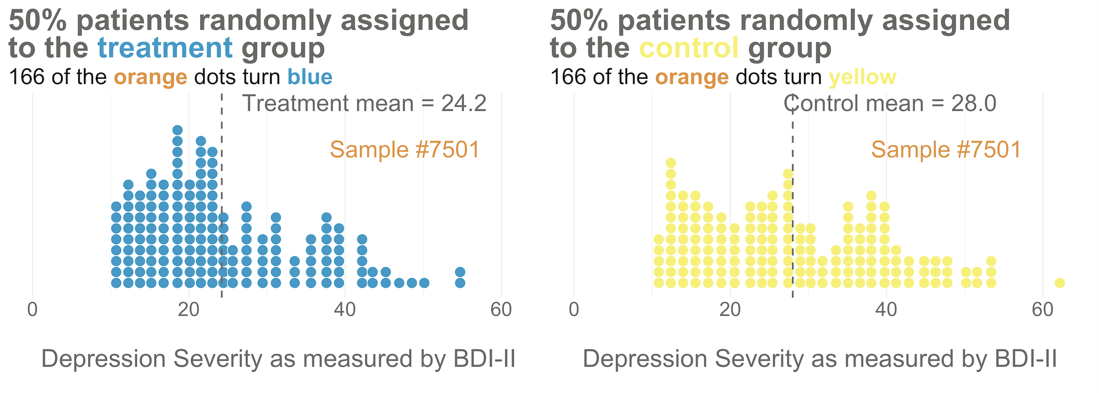
Distribution of baseline BDI-II scores by study arm. Even with random assignment the group means are not 100% identical at baseline. This is normal. Reproduced from Chapter 6.
Slide 9
Now imagine the treatment is not superior
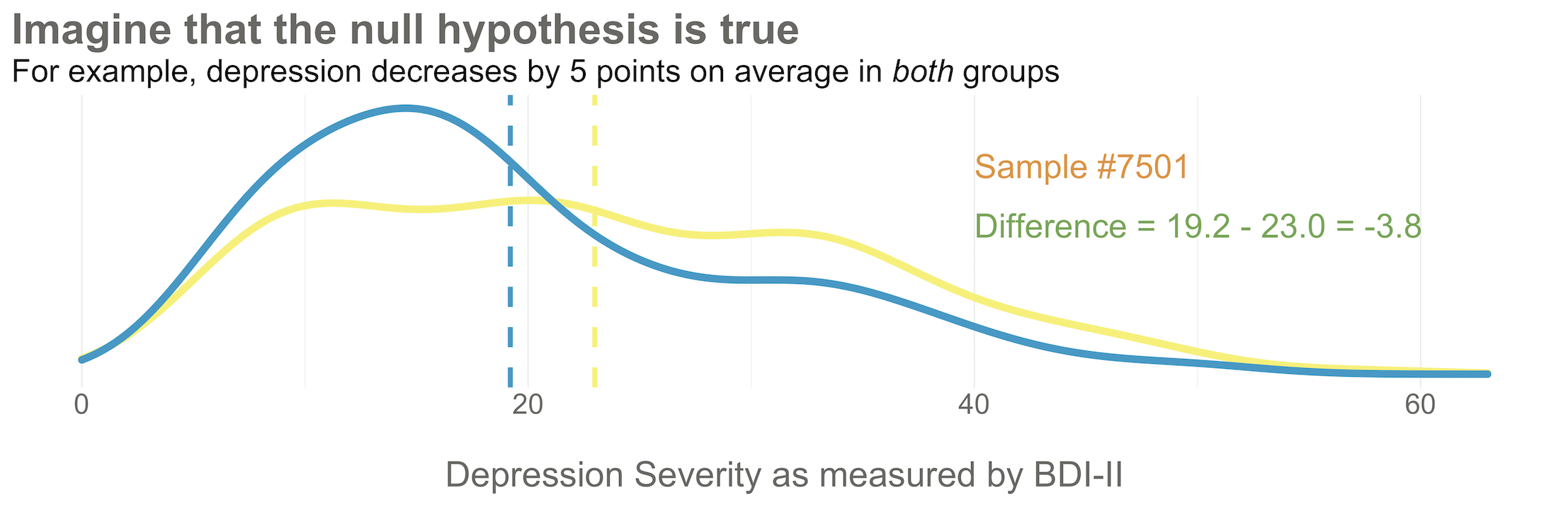
Distribution of endline BDI-II scores by study arm. Here's what it might look like if depression severity reduces by 5 points in both groups. Reproduced from Chapter 6.
Slide 10
If the null is true, why isn't every result exactly zero?
There is error in data collection
And sampling error, because we only include a small fraction of the population
So we might get a result near 0, but not exactly 0, even if the null is really true
Slide 11
10,000 studies, run in a world where the treatment does nothing
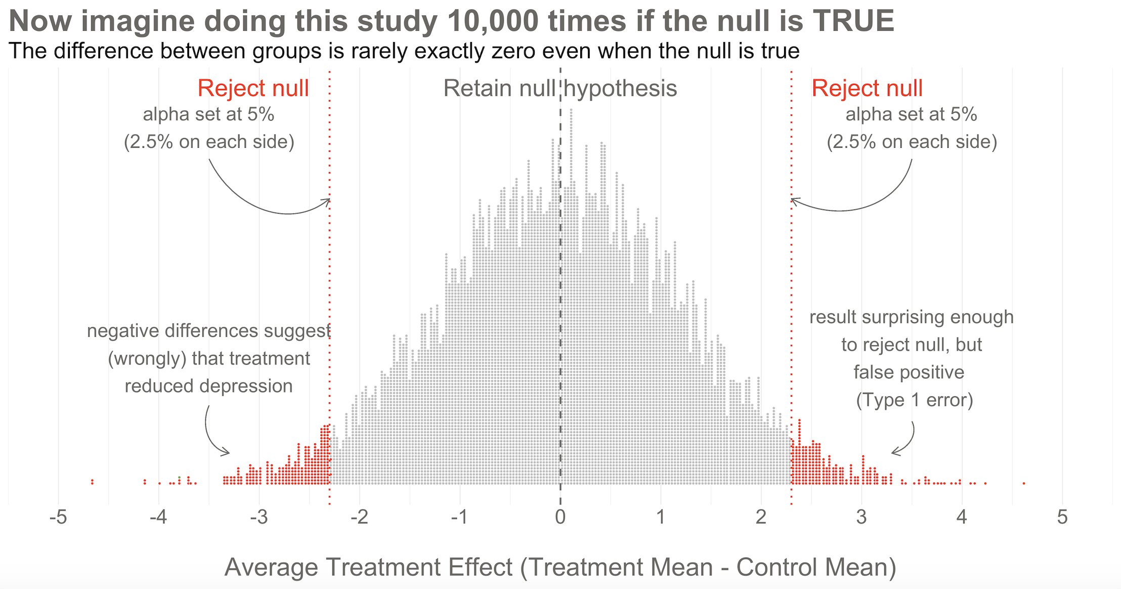
10,000 simulated results when there's no effect. Unlike the previous figures, this time the dots are study results, not people. Reproduced from Chapter 6.
Slide 12
This is the Central Limit Theorem at work
Replications form a distribution that approximates a normal distribution
We know useful things about normal curves
Find any study result on the curve and you know where it falls
Slide 13
Without the collective, there can be no probability
Frequentists can only talk about a result being in the 1st or 50th percentile
If there is a group of results that make up the collective
The plot of 10,000 studies is that collective. It is the denominator
Slide 14

An aside
Where's the smooth bell curve?
Slide 15
The answer is probability theory
Assume the null is true, and the only randomness is sampling and random assignment
The Central Limit Theorem tells us those statistics follow predictable shapes
Standard errors and t-statistics encode the width and shape of that curve
Slide 16
Two routes to the same destination
Simulation helps build intuition
Theory provides computational shortcuts
Watching the dots emerge makes the abstract formulas feel more real
Slide 17
In Closing
The collective is statistically derived, and imaginary
No Frequentist repeats a study 10,000 times
They rely on the central limit theorem to imagine the most plausible results
That imaginary collective is fundamental to the Frequentist approach
Imagine a world where the treatment does nothing
Slide 1This video is about the strangest move in Frequentist inference. To judge the one study you actually ran, you first have to imagine an infinite number of studies in which your treatment never worked. We'll build that imaginary world one figure at a time, using the depression trial from the last video as inspiration.
Step 1
Specify two precise statistical hypotheses
H0, the null: there is no difference in average depression severity between the groups
H1, the alternative: the average difference between the groups is not zero
Two-tailed, so it does not specify which arm is superior
Slide 2Step 1 is to specify two hypotheses. In hypothesis testing we set up two precise statistical hypotheses: a null hypothesis and an alternative hypothesis. Most often the null hypothesis is stated as the hypothesis of no difference. Here, that there is no difference in average depression severity between the group that was invited to receive the program plus enhanced usual care, and the group that only received enhanced usual care. A two-tailed alternative hypothesis states that there is a difference, but does not specify which arm is superior. It says the average difference between the groups is not zero.
The null is where statistical inference happens
H1 is the hypothesis we talk about and write about
H0 is the one we test, and decide to reject or fail to reject
The Frequentist does not directly prove the alternative
Slide 3It might seem confusing, because the alternative is the hypothesis we talk about and write about. But it's actually the null hypothesis that we test, and decide to reject or accept. Technically, fail to reject. The null is where statistical inference happens. The Frequentist rejects or retains the null hypothesis, but does not directly prove the alternative. They simply decide whether there is sufficient evidence to convict the null.
Step 2
Imagine a world in which the null is true
Frequentists subscribe to the long run view of probability
That requires a collective: a group of events used to calculate a probability
Your study is just one event
Slide 4Step 2 is where things get a bit weird. Frequentists subscribe to the long run view of probability. In this framework, you have to establish a collective, a group of events that you can use to calculate the probability of observing any single event. Your study is just one event. You can't determine the probability of obtaining your specific results without first defining the collective of all possible studies.
You do not have to run your study 10,000 times
You can do it with your imagination and the magic of statistics
Picture running the study again and again, where the truth is always that the intervention does not work
The aim is to establish what type of data we're likely to find if the null hypothesis is true
Slide 5I know what you're thinking. This seems nuts. In my defense, I said it gets a bit weird. Hang with me though. The good news is that you do not have to repeat your study an infinite number of times to get the collective. You can do it with your imagination and the magic of statistics. So put on your wonder cap and imagine that you conducted thousands of experiments where the null was true. Picture running your study over and over again with a new group of people, but the truth is always that the intervention does not work. The aim of this thought exercise is to establish what type of data we're likely to find when the null hypothesis of no difference is true.
A hypothetical population of 6,705 eligible patients
Hypothetical population of depressed patients. Center and spread come from the authors' protocol: a prior study reported a control BDI-II mean of 24.5, SD 10.7. Reproduced from Chapter 6.
Slide 6To kick things off, consider this hypothetical accessible population of 6,705 depressed people who are eligible for the trial. In each of your imagined studies, you'll recruit a new sample of 332 patients from this population. Let's assume that the baseline level of depression severity among this population ranges from a score of 10 to 63 on the depression instrument you're using, the BDI-II. I say assume because you'll never get to know more than 332 of these 6,705 patients. We know they exist, but we don't know the true population size, or the true average level of depression among this group.
One sample of 332 patients, drawn from that population
Here's the sample of 332 patients you recruit into your study. The trial planned to recruit 500 and expected to lose track of 15%, giving a planned effective sample of 332. Reproduced from Chapter 6.
Slide 7Next, imagine that each orange dot represents 1 of the 332 patients you recruited into the actual study you conducted. You do know each one of these people, you do measure their depression level at baseline, and you do calculate the sample mean. This is the only sample you'll see as the researcher in real life. But let's pretend that this sample was number 7,501 out of an imaginary set of 10,000 simulated studies.
Randomize 1:1 — 166 to treatment, 166 to control
Distribution of baseline BDI-II scores by study arm. Even with random assignment the group means are not 100% identical at baseline. This is normal. Reproduced from Chapter 6.
Slide 8Your trial design is a randomized controlled trial, so you randomize these 332 people to the treatment group or the control group. You allocate 1 to 1, meaning that 166 patients go to the treatment arm, and 166 to the control arm. Notice that even with random assignment, the group means are not 100% identical at baseline. This is normal. As the sample size gets bigger, randomization produces better balance.
Now imagine the treatment is not superior
Distribution of endline BDI-II scores by study arm. Here's what it might look like if depression severity reduces by 5 points in both groups. Reproduced from Chapter 6.
Slide 9Now I'd like you to imagine that your intervention is not superior to enhanced usual care alone, and vice versa. A few months after the treatment arm completes the program, you reassess everyone in the study and find that the average depression score in both groups decreases by 5 points. Since the baseline mean for the program group was 24.2, and the enhanced usual care arm mean was 28.0, the endline means shift down by 5 points, to 19.2 and 23.0. The effect size, in this example the average post-intervention difference between groups, is 19.2 minus 23.0, which is negative 3.8. The instrument ranges from a possible score of 0 to 63, so an absolute difference of 3.8 points is small, but it's not 0.
If the null is true, why isn't every result exactly zero?
There is error in data collection
And sampling error, because we only include a small fraction of the population
So we might get a result near 0, but not exactly 0, even if the null is really true
Slide 10I see you raising your hand. If the null hypothesis of no difference is actually true, why isn't every study result exactly zero? It's a good question. The reason is this. There's error in data collection, and sampling error that comes from the fact that we only include a small fraction of the population in our study samples. Therefore, we might get a result that is near 0, but not exactly 0, even if the null hypothesis is really true.
10,000 studies, run in a world where the treatment does nothing
10,000 simulated results when there's no effect. Unlike the previous figures, this time the dots are study results, not people. Reproduced from Chapter 6.
Slide 11Hopefully this figure will make the point clear. To help you imagine a world in which the null is true, I drew 10,000 samples of 332 people from the simulated accessible population of about 6,700, randomly assigned each person to a study arm, and calculated the treatment effect for the study if everyone's depression score reduced by exactly 5 points. This figure plots all 10,000 study results. Here's the key thing to observe. I simulated 10,000 studies where everyone always improved by an equal amount. No treatment effect. But there is not just one stack of results piled 10,000 high at exactly zero. Instead, the results form a nice bell shaped curve around 0.
This is the Central Limit Theorem at work
Replications form a distribution that approximates a normal distribution
We know useful things about normal curves
Find any study result on the curve and you know where it falls
Slide 12This is the Central Limit Theorem at work. When plotted together, the results of our imaginary study replications form a distribution that approximates a normal distribution as the number of imaginary replications increases. This is fortunate, because we know useful things about normal curves. For instance, we can find any study result on the curve and know where it falls in the distribution. Is it in the fat part around 50%? Or is it a rather extreme result, far in the tails at 1% or 2%?
Without the collective, there can be no probability
Frequentists can only talk about a result being in the 1st or 50th percentile
If there is a group of results that make up the collective
The plot of 10,000 studies is that collective. It is the denominator
Slide 13To conclude Step 2, let's think back to the Frequentist definition of probability that relies on having some collective of events. This plot of 10,000 results represents that collective. Frequentists can only talk about a particular result being in the first or fiftieth percentile of results if there is a group of results that make up the collective. Without the collective, the denominator, there can be no probability.
An aside
Where's the smooth bell curve?
Slide 14If you've taken a statistics course before, you might be wondering: where's the smooth bell curve? In most textbooks and software, you don't see a pile of simulated dots. You see a smooth bell-shaped curve, the null distribution, already drawn for you. Where does that come from if we only ran one study?
The answer is probability theory
Assume the null is true, and the only randomness is sampling and random assignment
The Central Limit Theorem tells us those statistics follow predictable shapes
Standard errors and t-statistics encode the width and shape of that curve
Slide 15The answer is probability theory. Once we assume the null hypothesis is true, the only randomness comes from sampling and random assignment. The Central Limit Theorem tells us that if you repeatedly draw samples and calculate means, or differences in means, those statistics follow predictable shapes, often normal curves. The formulas you learned, standard errors and t-statistics, encode the width and shape of that curve mathematically. So software like R doesn't need to rerun your study thousands of times. It applies these probability results directly, using your sample size and variability, to generate the null distribution analytically. The smooth curve isn't made up. It is the mathematical object that represents the infinite set of possible study results under the null hypothesis.
Two routes to the same destination
Simulation helps build intuition
Theory provides computational shortcuts
Watching the dots emerge makes the abstract formulas feel more real
Slide 16The simulation I showed you and the theory-based curve you see in textbooks are two routes to the same destination. Simulation helps build intuition; theory provides computational shortcuts. If you're like me, watching the bell-shaped pile of dots emerge from simulation makes the abstract formulas feel more real.
In Closing
The collective is statistically derived, and imaginary
No Frequentist repeats a study 10,000 times
They rely on the central limit theorem to imagine the most plausible results
That imaginary collective is fundamental to the Frequentist approach
Slide 17Of course, in reality, no Frequentist repeats a study over and over 10,000 times to get the collective. They rely on the central limit theorem to imagine the most plausible set of results that might occur when the null hypothesis is really true. This statistically derived, but imaginary, collective is fundamental to the Frequentist approach. In the next video we set the goal posts on this curve, and find out what happens to study number 7,501.