Chapter 5 · Video 5
Reading tables and figures
Print layout
Slide 1


Reading tables and figures
Slide 2
Oelofse et al., 2026
One study, four kinds of display
Linezolid interruption and rechallenge in rifampicin-resistant TB, South Africa
An antibiotic with bad side effects, so some patients pause and restart
A baseline table, regression output, a flow diagram, and Kaplan-Meier curves
Slide 3
Table 1 tells you who was actually in the study
It reveals potential confounders that might affect results
In trials, whether randomization achieved balance between groups
And it can only show variables the researchers collected
Slide 4
Table 1: two groups that differ on almost everything
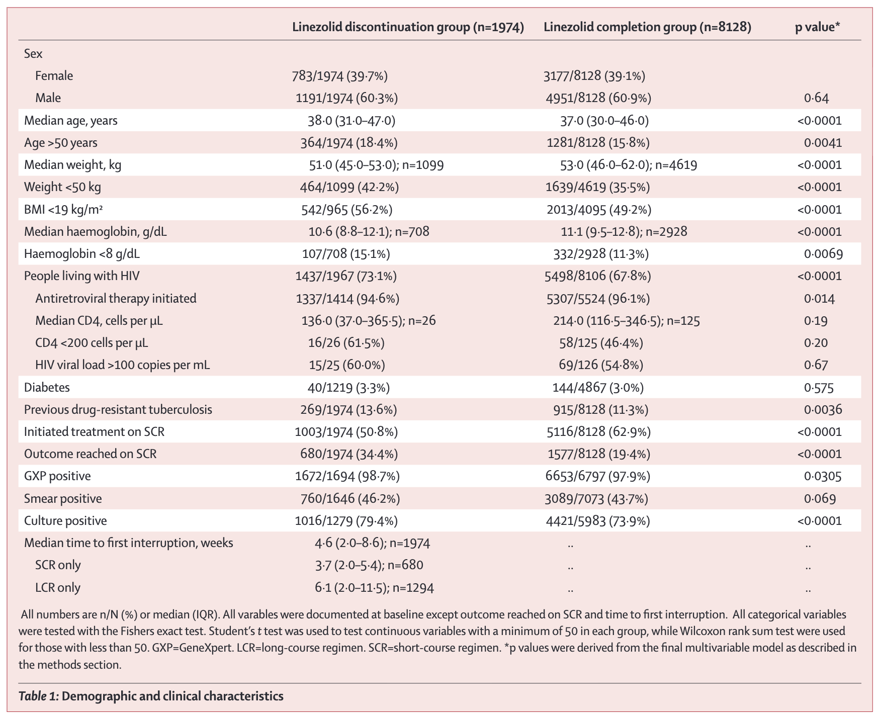
Demographic and clinical characteristics. Note the shifting denominators: 1,099 of 1,974 for weight, 708 for haemoglobin. Source: Oelofse et al., 2026. CC BY 4.0.
Slide 5
Regression output looks intimidating and is interpretable
Coefficients estimate the association between a predictor and the outcome
Standard errors indicate precision; larger means more uncertainty
In logistic regression, exponentiated coefficients give odds ratios
Slide 6
Table 2: same method, far fewer patients, precision falls apart
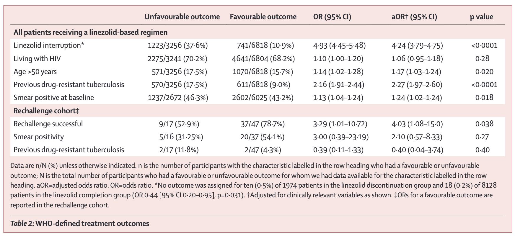
WHO-defined treatment outcomes. Unadjusted OR 4.93; adjusted 4.24, 95% CI 3.79–4.75. Rechallenge aOR 4.03, CI 1.08–15.0. Source: Oelofse et al., 2026. CC BY 4.0.
Slide 7
Kaplan-Meier curves show the probability of remaining event-free over time
Separation between curves indicates differential outcomes between groups
Numbers at risk show how many participants remain in follow-up
Steep drops in those numbers signal potential bias from loss to follow-up
Slide 8
Figure 3
The gap opens early and persists
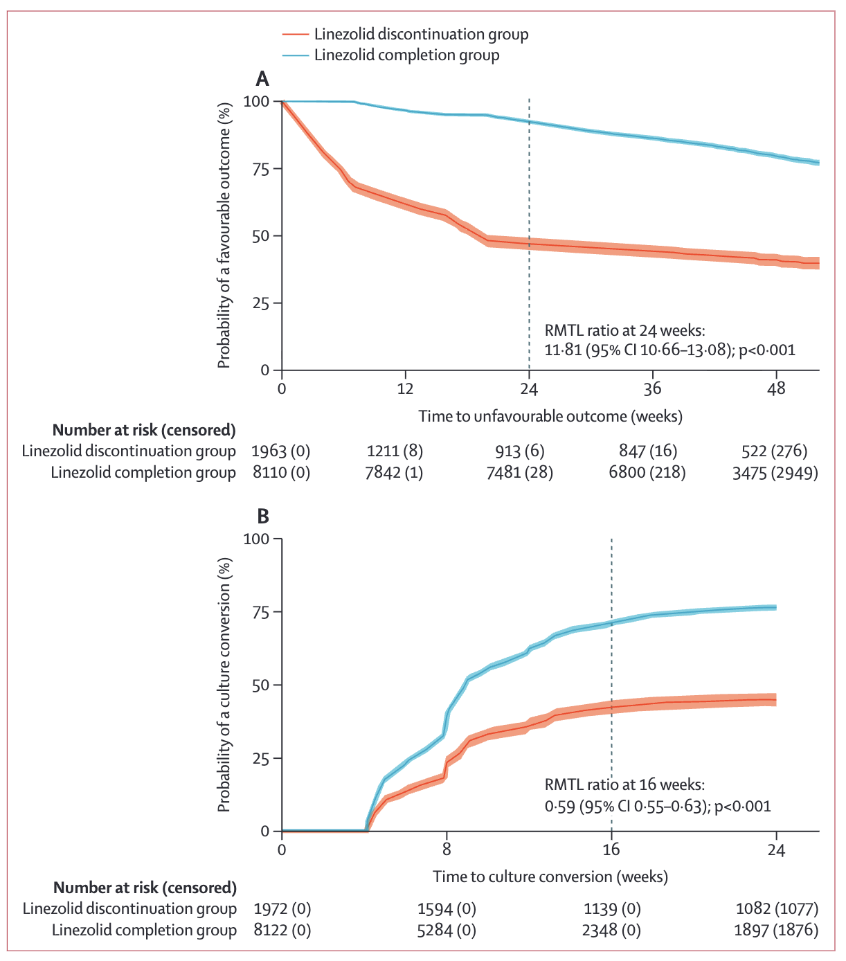
Kaplan–Meier estimates: time to an unfavourable outcome (A) and time to culture conversion (B). Source: Oelofse et al., 2026. CC BY 4.0.
Slide 9
Flow diagrams trace participants from source population to analyzed sample
How many were screened, and how many enrolled?
How did the sample narrow at each stage, and who was lost to follow-up?
500 enrolled and 200 analyzed is a potential attrition problem
Slide 10
Figure 1: 12,064 on the register, 10,102 in the analysis
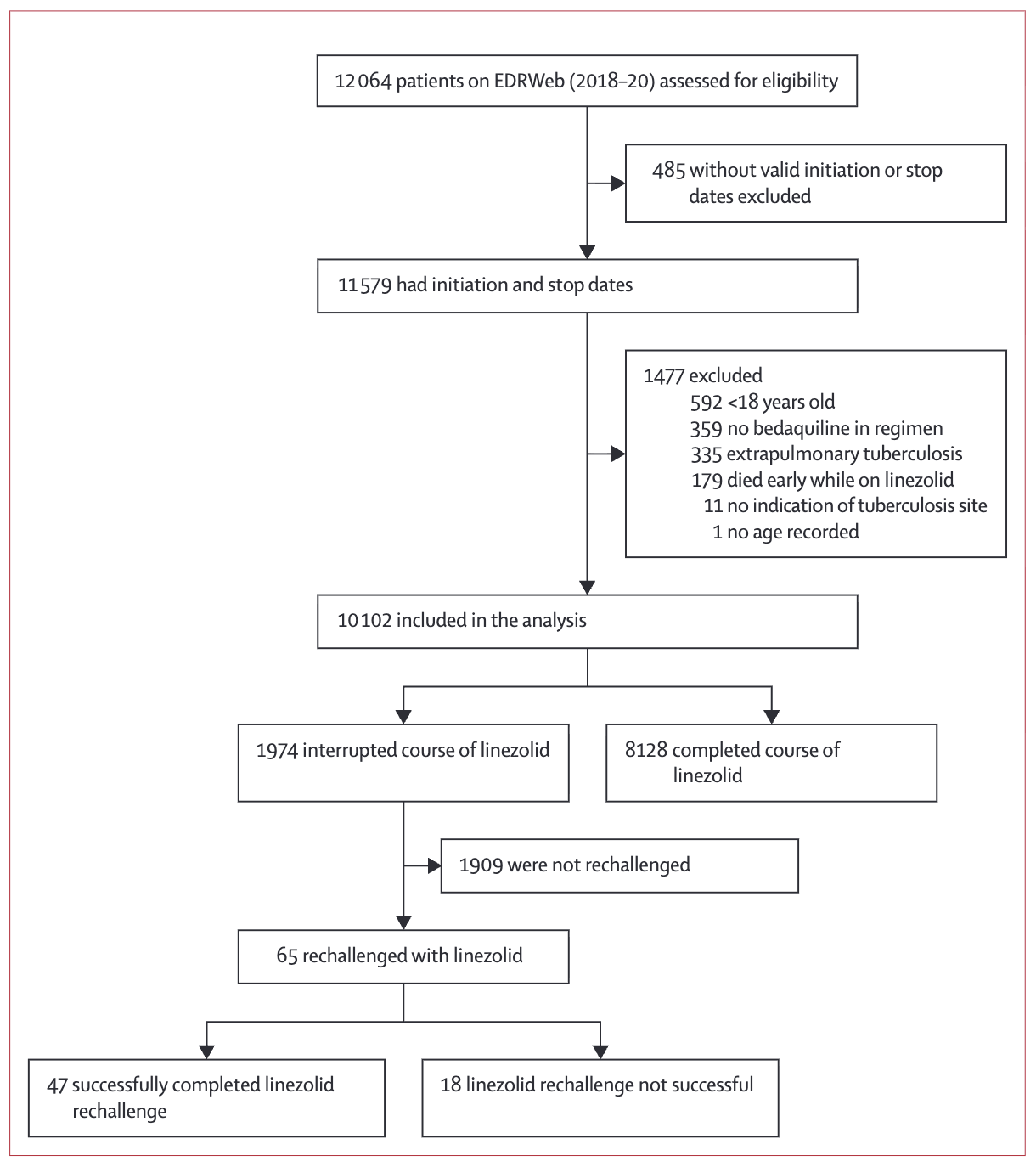
Study overview. Each exclusion is defensible and each one narrows generalizability. Only 65 of 1,974 interrupters were rechallenged. Source: Oelofse et al., 2026. CC BY 4.0.
Slide 11
Forest plots display effect estimates from multiple studies
Squares: the point estimate
Horizontal lines: the 95% interval
Vertical line at 1.0: the line of no effect
Diamond at the bottom: the pooled estimate across studies
Slide 12
Preventive antimalarials in pregnancy, and maternal death
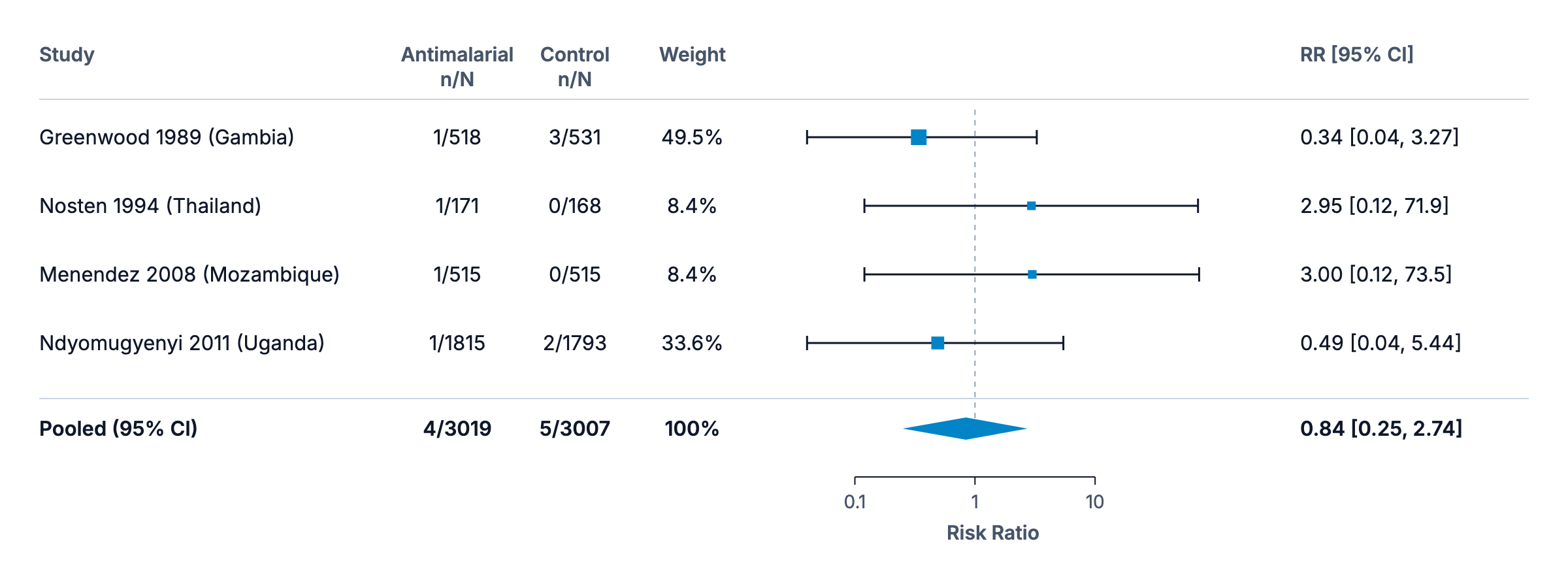
Four trials, nine deaths in total. Pooled RR 0.84, 95% CI 0.25–2.74. Data from the Cochrane Database of Systematic Reviews; plot redrawn from the chapter.
Slide 13
Absence of evidence is not evidence of absence
Maternal death is thankfully rare, so there are very few events to analyze
Point estimates run from 0.34 to 3.00 — benefit and harm in the same plot
The interval includes substantial benefit, no effect, and substantial harm
Slide 14
In Closing
The display is an argument, and you can audit it
Ask what each exclusion did to generalizability
Ask how many patients the thinnest branch actually holds
Next: qualitative rigor, and the discussion section
Reading tables and figures
Slide 1Most of the numbers in a paper live in its tables and figures. Critical readers evaluate whether the presentation accurately communicates the result.
Oelofse et al., 2026
One study, four kinds of display
Linezolid interruption and rechallenge in rifampicin-resistant TB, South Africa
An antibiotic with bad side effects, so some patients pause and restart
A baseline table, regression output, a flow diagram, and Kaplan-Meier curves
Slide 2The examples here come from a cohort study of linezolid interruption and rechallenge among patients with rifampicin-resistant tuberculosis in South Africa. Linezolid is an antibiotic used to treat multidrug-resistant and extensively drug-resistant tuberculosis. It can cause bad side effects, so some patients need to pause and then restart the medication. The study looks at what happens when patients interrupt and then rechallenge treatment. It's a useful exemplar, because one observational study gives us a baseline characteristics table, regression output, a participant flow diagram, and Kaplan-Meier curves.
Table 1 tells you who was actually in the study
It reveals potential confounders that might affect results
In trials, whether randomization achieved balance between groups
And it can only show variables the researchers collected
Slide 3Almost every quantitative paper includes a Table 1 showing participant characteristics at baseline, and it does critical work. It tells you who was actually in the study, and not just who was targeted. It reveals potential confounders that might affect results. In trials, it shows whether randomization achieved balance between groups. And it helps you assess generalizability to your population of interest. Three questions to ask of it. Are the groups similar on important characteristics? What's the profile of the study population? Average age 35 in a malaria prevention trial means something different from average age 65. And what's missing? Table 1 can only show you variables the researchers collected.
Table 1: two groups that differ on almost everything
Demographic and clinical characteristics. Note the shifting denominators: 1,099 of 1,974 for weight, 708 for haemoglobin. Source: Oelofse et al., 2026. CC BY 4.0.
Slide 4So look at this one. This is an observational study, so the two groups weren't formed by randomization. They differ on almost everything: age, weight, anemia, HIV positivity, prior drug-resistant TB. The p-values flag where differences this large would rarely arise from sampling alone if the two groups were truly equivalent. Note also the shifting denominators, 1,099 of 1,974 for weight, 708 for haemoglobin. That's a clue that missing data is substantial. Without adjusting for these baseline differences, you'd confuse the effect of interruption with the effect of being sicker to start with.
Regression output looks intimidating and is interpretable
Coefficients estimate the association between a predictor and the outcome
Standard errors indicate precision; larger means more uncertainty
In logistic regression, exponentiated coefficients give odds ratios
Slide 5Regression output can look intimidating, and the core elements are interpretable. Coefficients estimate the association between each predictor and the outcome. In linear regression they represent the change in outcome per unit change in predictor, holding other variables constant. In logistic regression, exponentiated coefficients give odds ratios. Standard errors indicate precision; larger standard errors mean more uncertainty. Confidence intervals provide a range of plausible values for each coefficient. And p-values test the null hypothesis, typically that the true coefficient is zero.
Table 2: same method, far fewer patients, precision falls apart
WHO-defined treatment outcomes. Unadjusted OR 4.93; adjusted 4.24, 95% CI 3.79–4.75. Rechallenge aOR 4.03, CI 1.08–15.0. Source: Oelofse et al., 2026. CC BY 4.0.
Slide 6Read across the columns here. The unadjusted odds ratio for linezolid interruption is 4.93, meaning patients who interrupted had almost five times the odds of an unfavourable outcome. The adjusted odds ratio, 4.24, accounts for age, HIV status, previous drug-resistant TB, and smear positivity. Adjustment shrinks the estimate slightly, the effect remains large, and the interval, 3.79 to 4.75, is narrow because the sample is large. Now compare the rechallenge row at the bottom. The adjusted odds ratio for rechallenge success is 4.03, but the interval runs from 1.08 to 15.0. Same method, far fewer patients, and the precision falls apart. One footnote worth carrying: when outcomes are rare, odds ratios and risk ratios are nearly identical, and when outcomes are common they diverge, sometimes substantially.
Kaplan-Meier curves show the probability of remaining event-free over time
Separation between curves indicates differential outcomes between groups
Numbers at risk show how many participants remain in follow-up
Steep drops in those numbers signal potential bias from loss to follow-up
Slide 7Kaplan-Meier curves show the probability of survival, or of remaining event-free, over time. The y-axis shows proportion event-free; the x-axis shows time; and curves step down as events occur. Two features matter. Separation between curves indicates differential outcomes between groups, and curves that diverge and stay apart suggest sustained differences. And the numbers at risk, typically shown below the plot, indicate how many participants remain in follow-up at each time point. Steep drops in those numbers signal potential bias from loss to follow-up.
Figure 3
The gap opens early and persists
Kaplan–Meier estimates: time to an unfavourable outcome (A) and time to culture conversion (B). Source: Oelofse et al., 2026. CC BY 4.0.
Slide 8Two things stand out here. First, the separation. By 24 weeks the completion group still has roughly 75% favourable outcomes, while the discontinuation group has dropped near 50%. The gap opens early and persists. Second, that number at risk row below the plot. Censored counts, the ones in parentheses, grow rapidly past 36 weeks, so estimates at the right edge of the curve depend on fewer and fewer patients. Be cautious about reading too much into the tails.
Flow diagrams trace participants from source population to analyzed sample
How many were screened, and how many enrolled?
How did the sample narrow at each stage, and who was lost to follow-up?
500 enrolled and 200 analyzed is a potential attrition problem
Slide 9Study flow diagrams trace participants from the source population through to the analyzed sample. The exact form depends on the study design. Randomized trials use CONSORT diagrams, which follow participants through screening, randomization, allocation, follow-up, and analysis. Observational studies use simpler diagrams that trace eligibility, exclusions, and subgroup splits without the randomization step. Across designs you're looking for the same things: how many people were screened versus enrolled, how the sample narrowed at each stage, how many were lost to follow-up and why, and how many ended up in the analysis. If a study enrolled 500 participants but analyzed only 200, that's a potential attrition bias problem worth investigating.
Figure 1: 12,064 on the register, 10,102 in the analysis
Study overview. Each exclusion is defensible and each one narrows generalizability. Only 65 of 1,974 interrupters were rechallenged. Source: Oelofse et al., 2026. CC BY 4.0.
Slide 10Trace the path here, top to bottom. The study began with 12,064 patients on the national register and ended with 10,102 in the analysis, after excluding cases with missing dates, children, patients without bedaquiline, extrapulmonary TB, and early deaths. Where did people drop out, and what does each exclusion do to generalizability? Each exclusion here is defensible, and each one narrows generalizability. The findings apply to adults with pulmonary disease who survived long enough to potentially interrupt linezolid, and not to the original 12,064. Now look down the rechallenge branch. Only 65 of 1,974 interrupters, 3.3%, were rechallenged at all. That branch is the rate-limiting subgroup for any conclusion about rechallenge, and a thin branch like this should make you ask whether the study has enough cases there to support its claims.
Forest plots display effect estimates from multiple studies
Squares: the point estimate
Horizontal lines: the 95% interval
Vertical line at 1.0: the line of no effect
Diamond at the bottom: the pooled estimate across studies
Slide 11Last display, and the one that unlocks the most. Forest plots display effect estimates from multiple studies or subgroups. Each line represents a study, with a square showing the point estimate and horizontal lines showing the confidence interval. A diamond at the bottom represents the pooled estimate. They appear in nearly every meta-analysis. Once you can read one forest plot, you can read any forest plot.
Preventive antimalarials in pregnancy, and maternal death
Four trials, nine deaths in total. Pooled RR 0.84, 95% CI 0.25–2.74. Data from the Cochrane Database of Systematic Reviews; plot redrawn from the chapter.
Slide 12This one comes from a Cochrane review of antimalarials for preventing malaria during pregnancy, and it shows the effect of preventive antimalarials versus placebo or no intervention on maternal death. The columns give you the study, the events and totals in each group, the weight each study contributes to the pooled estimate, and the numerical risk ratio with its interval. Look at the top row, Greenwood 1989, in the Gambia. The square sits at 0.34, meaning the risk of maternal death was 66% lower in the antimalarial group. But the horizontal line extends from 0.04 to 3.27, a huge range that crosses 1.0. This study had only 1 death in the intervention group and 3 in the control group, too few events to draw confident conclusions. The wide confidence interval tells you the estimate is imprecise. Now the diamond at the bottom. It's centered at 0.84, with an interval of 0.25 to 2.74. Because that interval includes 1.0, the pooled effect is not statistically significant.
Absence of evidence is not evidence of absence
Maternal death is thankfully rare, so there are very few events to analyze
Point estimates run from 0.34 to 3.00 — benefit and harm in the same plot
The interval includes substantial benefit, no effect, and substantial harm
Slide 13So what does this forest plot tell us? Maternal death is thankfully rare, so even with thousands of participants enrolled across these trials, there are very few events to analyze. Few events mean wide confidence intervals. The individual point estimates range from 0.34 to 3.00, with some studies suggesting benefit and others suggesting harm. When events are rare, random variation alone can produce swings this large. The pooled estimate is therefore inconclusive. The interval includes substantial benefit, no effect, and substantial harm. We can't tell from this evidence whether antimalarials affect maternal mortality. And that's the key reading lesson: absence of evidence is not evidence of absence. This plot doesn't show that antimalarials fail to reduce maternal mortality. It shows we don't yet have enough data to know.
In Closing
The display is an argument, and you can audit it
Ask what each exclusion did to generalizability
Ask how many patients the thinnest branch actually holds
Next: qualitative rigor, and the discussion section
Slide 14Every one of these displays is making an argument, and every one of them can be audited with the same two questions. What did each exclusion do to generalizability? And how many patients does the thinnest branch actually hold? Next, two parts of a paper you have to read without numbers: qualitative findings, and the discussion section.